![]()
Freelance
![]()
![]()
![]()
![]()
![]()
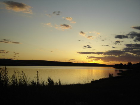
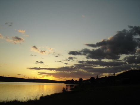
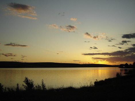
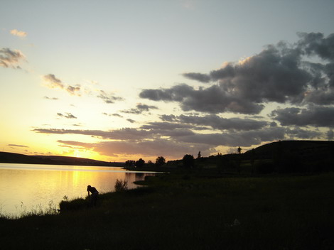
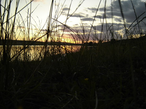
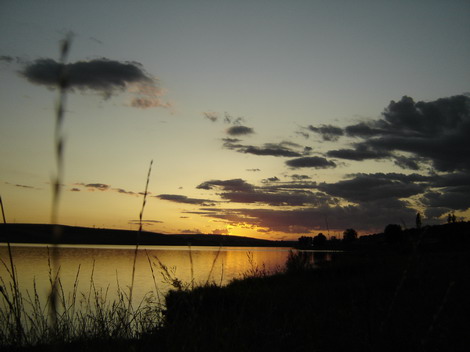
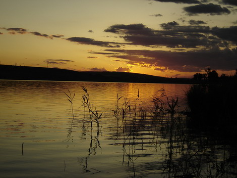
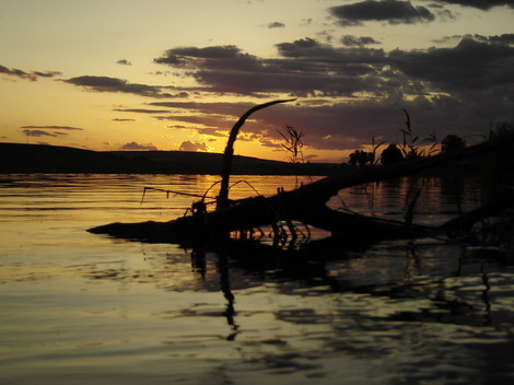
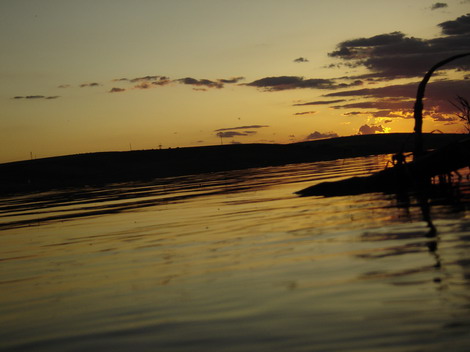
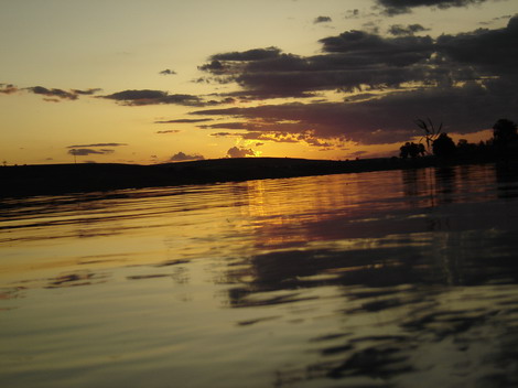
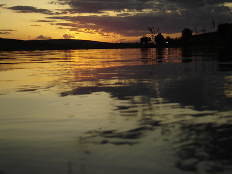
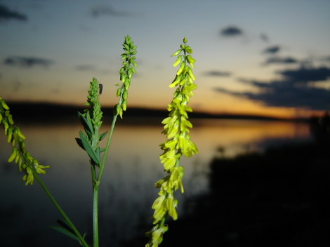
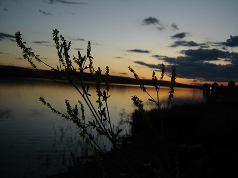
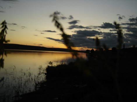
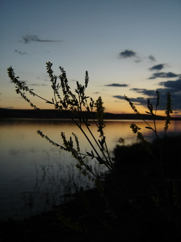
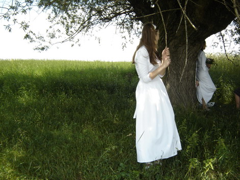
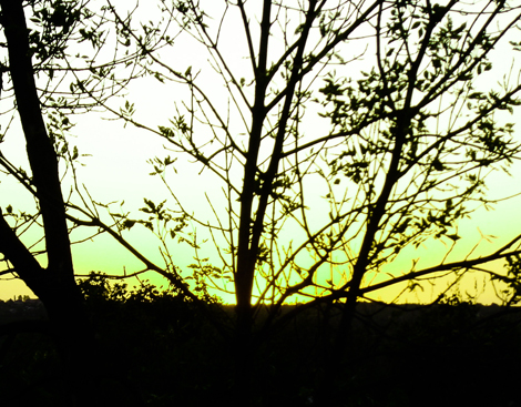
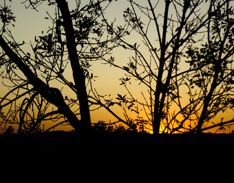
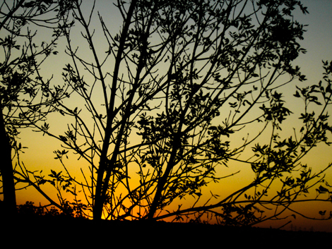
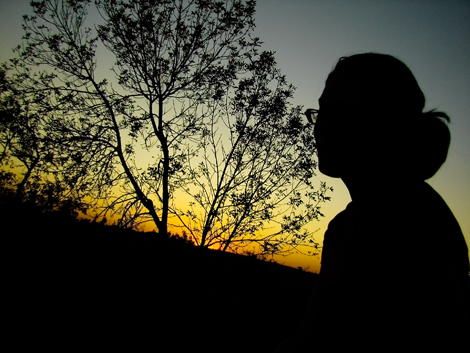
This weekend I was invited to go to Radauti, in Suceava district. It was an opportunity to meet new people. In the same time I managed to fill my fun-bag with memories. Andrei, Denisa’s brother, invited me on Wednesday to take part of their trip to Radauti. On Sunday, there were to be the baptism of 30 new Christians in a nearby river.
We left on Saturday from Iasi. We spend the night at Daniel’s family (not me… another Daniel, he’s from Radauti). On Sunday morning we attend church. At 2 pm, everyone gathered at the local river for the baptism. People asked me to do a lot of photos, especially at the river, before the baptism. It was a good time to practice photography.
I wish I would say more, but I am really busy with preparing for my master exams. Enjoy a few photos from the trip to Radauti, on my blog:

![]()


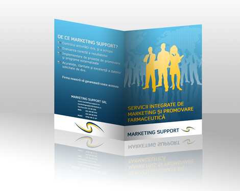
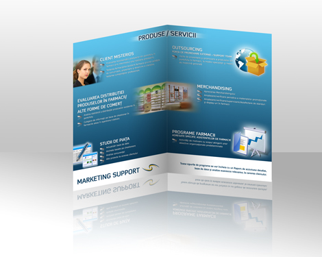
I was contacted by Marketing Support company to design for them a 4 page brochure. Actually it is kind of a folder.
In the first step I did some research on pharmaceutical marketing. Marketing Support Romania has as main field of expertise the pharmaceutical marketing. This brochure is targeted to this are of marketing, but in the same time they requested that the brochure could be used for other companies as well. If it would have been targeted 100% for the pharmaceutical field, than the brochure was more high-tech, with bottles, pills and chemical signs.
After the research was done, I had to decide on the colors I was going to use. I worked on color palette, that I later used in the graphic design process. I was provided with Marketing Support logo. But, I didn’t like the colors, the tints actually. After the color palette was chosen, I stepped to deciding the fonts and the point size that I’ll use. The logo I was provided with was actually in word, so I had to redo the logo it in Adobe Illustrator.
The next step consisted in creating the general layout. Because it is a simple brochure with only 4 pages I decided to do all the main work in Adobe Photoshop. I had to do some work on this because from the first place I already had an idea on how the brochure should look. In the end I got a better result than my original idea. Of coarse the color palette had to be tweaked.
After the fun part, came the DTP work. Many may say that it is just a cop-paste process. But that is not right. You have to fit everything to look just right. Play with the font size that I chosed and in the same time tweak it a bit. Because it the main target for this brochure is the pharmaceutical field I used as bullets a pill. I made the reflection and look for the best positioning of the bullet regarding the paragraph.
After all this was done, I had to take care of the graphics and images to use in the brochure. This took me a while, but in the end I was happy with the results.
Of coarse in all this process the client was involved. I provided them with plain versions and also 3D ones of the brochure’s preview. I asked the people from Marketing Support Romania if they like what I did. They send me their feedback and I did the changes accordingly, without the debates on what is best to do. This process repeated a few times, until it materialized in the final version of the brochure as you can see bellow…
![]()
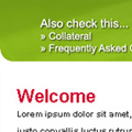
One of the current project that I work at is designing the company home page. I have to create the graphic for the banner but also to change a bit the whole website. There is still work to be done at this graphic project. For now I want to share with you what I’ve been working on…

![]()
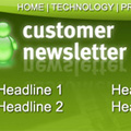
Between many projects in progress, one is more dear to me. It is the new Customer Newsletter I have to design. For now I create the template of the newsletter. Soon, I will be provided with the text to go with it. The customer newsletter is a powerful marketing tool. You draw all that customers, they are happy with your products. But, in time, if you do not remind them about you they end up forgetting your name. In the same time, do not send to many newsletters to your customers, because they’ll feel attacked. Once a month is enough to bother them.
Here are some cuts from what I’ve been working on in the last day or two…

![]()
Julie Beckham gives you some very general hints in her Tips for Creating an E-Newsletter. You can check it out